
The Shape of Delay: Why Two Projects Losing the Same Month Do Not Lose the Same Money
Two projects on your portfolio report have each slipped by a month. They carry the same amber status, the same revised date, the same paragraph of explanation about a supplier and a resourcing gap. On any dashboard you own, those two slips are the same event.
One of them cost you almost nothing. The other cost more than the annual budget of both projects combined. Nothing on the report distinguishes them, and the reason is that the number your portfolio uses to price delay describes only how fast value is leaking today, and says nothing at all about what happens next.
This piece is about the missing half of that number. Not the rate of delay, which most portfolios still do not calculate, but its shape: the way the cost of being late accumulates as the lateness grows. Get the rate and miss the shape, and you will sequence your portfolio confidently in the wrong order.
Drag cost gives you a rate. Sequencing needs a curve.
Drag cost is the right foundation and this is not an argument against it. It converts a red status into a number: this project, late by this much, is costing the business roughly this many pounds a week. That single move is what lets delivery talk to finance, and a portfolio that has it is far ahead of one that does not.
But look closely at what it is. Drag cost is a rate, a measurement taken at a moment. When it goes on a report as a constant, a flat figure per week carried forward, an assumption is being smuggled in with it: that the fifth week of lateness costs the same as the first, and the twentieth costs the same as the fifth. The cost of delay is being modelled as a straight line.
The thing you actually need for a portfolio decision is the whole curve. Call it the cost of delay curve: cumulative value lost, plotted against how late you are. Drag cost is the slope of that curve at the point you happen to be standing on. For some projects the slope is constant and one measurement tells you everything. For a great many others the slope changes, sometimes gently, sometimes vertically, and a single reading taken today tells you almost nothing about what a decision today will cost you in eight weeks.
Four shapes, and only one of them is a straight line
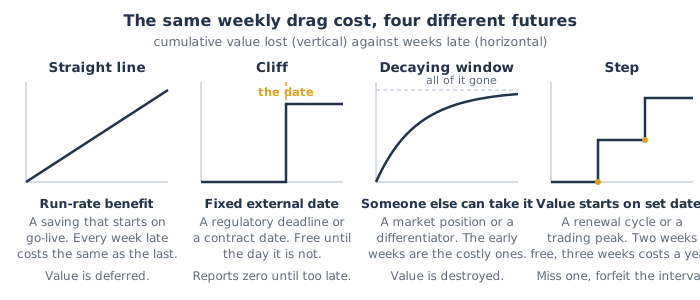
Nearly every project in a portfolio falls into one of four shapes, or a combination of two of them.
The straight line. A run-rate benefit: a cost saving, an efficiency, a licence retired, a manual process automated. Go live on Monday and it saves a fixed amount every week from then on, indefinitely. Delay simply defers the start of an annuity, and each week of delay costs exactly the same as the last. This is the only shape a flat drag cost figure models correctly, and it is the shape the technique was built against.
The cliff. A fixed external date: a regulatory deadline, a contractual commitment, the end-of-support date on a platform you are migrating off, a seasonal trading window that opens once a year. The cost of delay is approximately zero for every week up to the date and enormous the moment you cross it. Being six weeks early is worth no more than being one day early. Being one day late costs the entire penalty. The curve is flat, and then it is vertical.
The decaying window. Value that somebody else can take while you are still building. A market entry, a differentiating feature, a competitive response, a first-mover pricing position. Here delay does not just postpone the benefit, it shrinks it, because the window is closing whether or not you are through it. The most expensive weeks are the early ones, and the curve rises steeply and then flattens, not because things are improving but because by then there is not much left to lose.
The step. Value that can only begin at discrete moments: an academic year, a contract renewal date, an annual price review, a peak trading period, a quarterly release train. Between the steps, delay costs nothing at all. Cross one and you forfeit the whole interval. Two weeks late is free; three weeks late costs twelve months of benefit. This shape is extremely common and almost never written down.
Plenty of projects carry two shapes at once. A compliance programme that also retires an expensive legacy system has a cliff on the regulatory date and a straight line underneath it. That is fine. What matters is that somebody has looked.
A worked example: the sequence that flips
Put numbers on it. These are illustrative; the shape of the answer is the point.
Your constrained resource is a small integration team, the one resource that sets your delivery speed. Two projects need it, each for eight weeks, and it cannot usefully do both at once. It is week zero.
Whitfield is a back-office automation. Once live it saves about £12,000 a week, indefinitely. A straight line.
Harbour is a regulatory reporting change that has to be live by week 14. Until then it earns nothing whatsoever. Miss the date and the exposure, remediation plus a restriction on writing new business while you are non-compliant, is put at around £600,000, and it does not scale down if you are only a fortnight late. A cliff.
Now read your own dashboard. Whitfield is accruing £12,000 a week of drag right now. It is a live, defensible, calculated number and it is sitting on the report in black and white. Harbour's drag cost this week is zero, because nothing it delivers is worth anything before week 14. Rank the two by what delay is currently costing and Whitfield goes first, comfortably. Every instinct in the room agrees: do the one that is bleeding money now.
Sequence A, Whitfield first. Whitfield goes live at week 8 and starts saving. Harbour runs from week 8 to week 16, two weeks past its deadline. You have banked eight weeks of savings you would otherwise have waited for, 8 x £12,000 = £96,000, and you have taken the £600,000 exposure.
Sequence B, Harbour first. Harbour goes live at week 8, six weeks clear of the deadline. Penalty: zero. Whitfield runs from week 8 to week 16, so its savings start eight weeks later than they might have, costing £96,000 in deferred benefit.
Sequence B is better by £504,000. Not a single thing about either project changed. Only the order.
And here is the part worth sitting with. The report that said Whitfield was costing £12,000 a week and Harbour was costing nothing was, on the day it was written, arithmetically correct. It measured the rate accurately and it was silent on the shape, and the entire £600,000 lived in the shape. Worse, the instrument does eventually notice. The moment week 14 passes, Harbour's drag cost leaps from zero to a very large number and the dashboard finally lights up. By then the information is worthless, because the decision that determined the outcome was made eight weeks earlier, when the figure said zero.
That failure mode should be familiar. It is the watermelon report wearing a finance jacket: an instrument that reads reassuring right up to the point where you can no longer act on what it eventually tells you.
Had anyone recorded the shape, the trade-off would have been trivial. Harbour needs eight weeks and is due at week 14, so the last possible start is week 6. That is a six-week decision window carrying a £600,000 exposure, which is £100,000 a week of decision-relevant drag against Whitfield's £12,000. The comparison is not close. It only looked close because one of the two numbers was never on the page.
Deferred value and destroyed value are not the same cost
The second thing a flat rate hides is subtler and, over a portfolio, probably more expensive.
Take two projects that have both slipped six months, both with a headline benefit of £10,000 a week. On a flat calculation each has cost you about £260,000 and they belong in the same column.
The first is an internal automation. Six months late means the saving starts six months later and then runs for as long as the system lives. Every pound of that £260,000 is deferred. The value still exists and you will eventually collect it; what you have genuinely lost is the time value of six months of cash flow. Unpleasant, and recoverable.
The second is a market-facing proposition on a decaying window. Six months late, a competitor has launched, and the segment you modelled at twelve per cent share now realistically supports seven. That is not a delay to the benefit, it is a permanent reduction in it. You have not deferred £260,000, you have destroyed the difference between two annuities, for as long as the product exists. The £260,000 is the small part of the loss. The large part never appears in a delay calculation at all, because it is not a delay, it is an impairment of the asset you were building.
Some delay postpones value. Some delay deletes it. Most portfolio reports show them in the same column, in the same colour, with the same commentary.
An organisation that cannot tell the two apart will systematically underprotect the second kind, and it will do so invisibly, because the damage only becomes visible when someone re-tests the business case against what is still capturable, which most organisations never do after approval. The instrument that would catch it is return on remaining investment: the discipline of asking what value is left ahead of you rather than what was promised behind you. Remaining value is precisely what a decaying window erodes, and a project whose window has closed is not a project that will deliver late. It is a project that will deliver less, and sometimes too little to be worth finishing.
Why single-project management is structurally blind to this
There is a clean structural reason the shape is missing from almost every business case, and it is not carelessness.
Inside a single project, the shape barely matters. You have one delivery date and you are trying to hit it. Whether missing it costs a smooth £12,000 a week or a sudden £600,000 changes almost nothing about what the project manager does on Tuesday: push for the date, escalate the blockers, protect the critical path. The shape becomes a decision variable only at the moment two projects compete for the same constrained resource, because that is the only moment anybody has to choose whose date moves.
So the information is close to useless at the level where it would naturally be held, and indispensable at the level where nobody collects it. That is the Project Illusion in a particularly clean form. Every project can be approved with immaculate financial rigour, a full NPV, a benefits schedule, a sensitivity analysis, and the portfolio containing them can still be sequenced by RAG colour and by whoever spoke most forcefully in the meeting, because none of that rigour was ever aimed at the question sequencing asks.
Notice what the gate actually tests. A business case is written to clear a hurdle: is this worth doing at all? A total value and an annual benefit answer that question completely. Sequencing asks something different: what does one more week of delay to this cost, compared with one more week of delay to that? No standard gate anywhere in a typical governance process asks the second question, so the data needed to answer it is never requested, and by the time the trade-off has to be made the only people who knew the shape have moved on.
It compounds with everything downstream. The whole logic of ranking work by value per constrained-resource hour depends on the value term being a fair description of what delay does to that value. Feed it a headline benefit when the real curve is a step, and you will spend, with complete confidence and a defensible-looking calculation, the three weeks that cost you a year.
What to do instead
1. Record a shape, not just a number. Every project carrying an economic value should carry one more field: which of the four shapes its cost of delay follows, and the date of any discontinuity. Four options and a date. That is a fifteen-minute conversation with the person who owns the benefit, and it is very probably the highest-return piece of data your portfolio is currently not collecting.
2. Put the discontinuities on the constraint's schedule, not the project's plan. Every cliff and every step is a hard date, and hard dates have to be visible where sequencing is actually decided, which is the loading of your constrained resource. A regulatory deadline that lives only in one project's risk register is invisible at the exact moment the trade-off gets made.
3. Convert cliffs and steps into a weekly rate before you compare them. You cannot rank a £600,000 cliff against £12,000 a week as they stand. Spread the exposure across the weeks in which you can still do something about it: £600,000 over a six-week decision window is £100,000 a week, and now the two numbers are directly comparable. This is a sequencing heuristic rather than a valuation, and it should not go anywhere near your accounts, but it does the one job you need, which is to stop a project that currently reports zero from being ranked as though zero were the truth.
4. Re-price the decaying ones every time they slip. Where the value depends on a window someone else can close, the business case has a shelf life. When the project moves, do not carry the original benefit forward unchanged; ask the benefit owner what is still capturable now. The answer is frequently much lower, and a materially lower answer changes not just the sequencing but whether the work should still be finished at all.
5. Buy your protection early, where the curve is flat. On cliff-shaped work the value of one recovered week just before the date is enormous, and the value of one recovered week three months out is nil. That inverts the usual instinct. The right response is rarely to accelerate at the end, when you are buying time at cliff prices under pressure. It is to start early enough that you never have to buy it. Schedule margin is cheap in week one and ruinous in week thirteen.
6. Ask for the shape at the gate, not on the report. Make it part of what a complete paper contains, alongside the value and the cost, in the same spirit as starting projects only when they can actually run. A business case that states a total benefit but not what delay does to it is not incomplete for approval purposes. It is incomplete for the only thing you will actually have to do with it afterwards, which is decide what it goes in front of and what it goes behind.
The objection you are already forming
"This is spurious precision. We can barely get a credible benefit figure out of a business case, and now you want a curve shape and a discontinuity date on top of it. The numbers we already have are educated guesses. Adding geometry to a guess does not turn it into a fact."
The objection is right about the estimates and wrong about what is being asked for. Nobody needs a calibrated curve, and nothing here requires a better benefit figure than the one you already have. The four shapes are a categorical judgement, not a measurement, and the person who owns the benefit can usually answer in under a minute: does this earn from day one, is there a date after which the value changes abruptly, and can somebody else take this while we wait? That is the whole exercise. You are not being asked to estimate anything more precisely. You are being asked to write down something you already know and currently throw away.
Then look at the asymmetry of getting it wrong. Tag a project as a straight line when it is a straight line and you have lost nothing. Tag it as a cliff when it was really a straight line and you sequence it somewhat too early, deferring another project's benefit by a few weeks, which is a bounded and recoverable error. Leave the shape off altogether and you carry a flat number into a sequencing decision, and the specific mistake you make is the £600,000 one. It is not a random error, either. The projects whose shape is missing are, by construction, the ones reporting nothing today, which means the omission fails in exactly one direction every time.
And the precision argument cuts the other way harder than it cuts this one. Current practice is not the absence of an assumption about shape. It is the silent, universal assumption that every cost of delay curve in the portfolio is a straight line, applied to every project, with no evidence, by default. That is about the strongest claim anyone could make about the shape of a delay cost, and it is being made everywhere, unexamined, because it is embedded in the format of the report rather than stated as a view. Replacing it with a one-word judgement from the person who owns the value is not an increase in speculation. It is a substantial reduction in it.
The rate tells you what delay is costing you this week. The shape tells you what next week's decision will cost you in three months. You need both, and only one of them is on your report.
If this changed how you read your own portfolio, the two ideas underneath it are worth revisiting: what a week of lateness is actually worth, in Drag Cost, and how to order work once you know, in Value per Constrained Resource Hour.