
The Watermelon Report: Why Your Status Dashboard Goes Green Until the Week It Goes Red
Every portfolio has a project that went from green to red in a single reporting cycle. For months the status was fine. The percentage complete climbed steadily, the milestones were mostly ticked, the summary read on track. Then, a few weeks before the deadline, it turned red seemingly overnight, and everyone asked the same question: how did we not see this coming?
The honest answer is uncomfortable. You did not see it coming because the number you were watching is structurally incapable of warning you. A status report that is green on the outside and red on the inside is not a failure of honesty. It is a failure of measurement. The project was in trouble for a long time; the metric simply had no way to show it until the trouble reached the finish line.
This is the watermelon report, and it is one of the most expensive habits in project delivery. Not because people lie, but because percent-complete is the wrong instrument, and almost every organisation is still flying by it.
Why percent-complete cannot warn you
Percent-complete feels like a progress metric. It is really a consumption metric. It tells you how much of the plan has been used up, not how much risk remains between here and done. Those are different questions, and the gap between them is where every nasty surprise lives.
Three properties make it blind as an early warning.
It is self-reported and soft. Ask someone how complete a task is and you will usually hear a number that reflects effort spent and optimism about what remains. This is why so much work sits at "ninety percent done" for as long as it took to reach ninety percent in the first place. The last, hardest, most uncertain slice is exactly the part the number is worst at seeing, because it is the part nobody has hit yet.
It is an average that hides its worst element. A project reported as seventy percent complete is an aggregate across many tasks and paths. One path can be falling apart while the headline number keeps rising, because the tasks that are going well drag the average up and mask the one that will actually determine the finish date. Averages are precisely the wrong summary for a system whose completion is governed by its worst path.
It is lagging, not leading. By the time percent-complete flattens out and refuses to move, the problem it represents has already happened. The metric confirms trouble; it does not predict it. And a control signal that only arrives after the fact is not a control signal at all. It is a post-mortem.
Put these together and the watermelon is inevitable. The green is real in the sense that the plan is being consumed roughly on schedule. The red underneath is also real, and growing, and invisible to the instrument on the dashboard.
The number the plan was built to protect
There is a better signal, and if you have followed this series you already have the ingredient that produces it.
In why padded estimates still finish late, the argument was that safety scattered task by task never survives to the deadline, and that the fix is to strip the padding out of individual estimates and pool it into a single buffer at the end of the chain, sized to defend the completion date against the variability of the whole path. Estimate honestly, protect once, at the finish.
That move does something powerful. It creates, for the first time, a single quantity whose depletion tracks the true health of the project: the buffer. Every task that runs long against its honest estimate eats into it. Every task that runs short hands time back. The buffer is the plan's shock absorber, and how much of it is left is the most direct measure you have of how much protection stands between the project and a missed date.
So the health of a project stops being a wall of task-level dates coloured red and green, and becomes a single relationship between two numbers:
- How much of the chain is actually finished.
- How much of the buffer has been consumed to get there.
Neither number means much alone. A project that has burned sixty percent of its buffer might be in serious trouble or perfectly fine - it depends entirely on how much work that bought. Sixty percent of the buffer to deliver ten percent of the chain is a fire. Sixty percent of the buffer to deliver eighty percent of the chain is a project comfortably on its way home. The signal is the ratio, not either figure by itself.
The fever chart
Plot those two numbers against each other and you get the single most useful control instrument in flow-based delivery. On the horizontal axis, how far through the chain you are, from zero to done. On the vertical axis, how much of the buffer you have consumed, from full to empty. Each reporting cycle, the project is one dot. Over time, the dots trace a line.
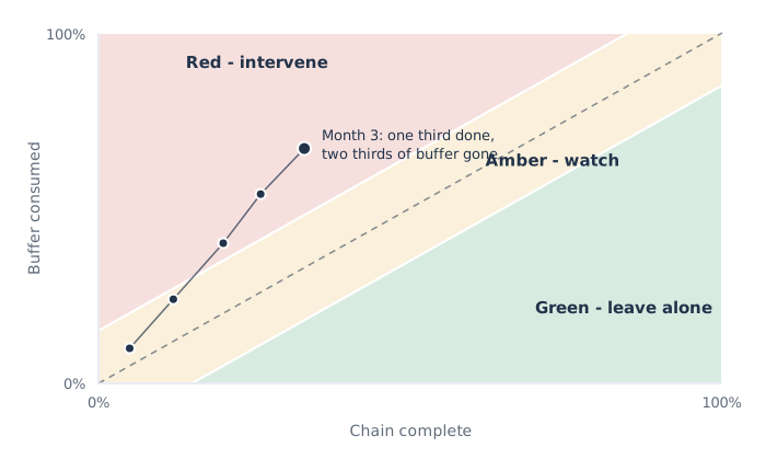
The diagonal is the honest expectation: if consuming the buffer roughly in step with completing the work, the dot climbs the middle of the chart, and that is fine. That is what the buffer is for. Some tasks were always going to run long against an aggressive estimate, and spending buffer to absorb them is the system working as designed, not a problem to escalate.
The chart resolves into three zones.
Green, in the lower right, means progress is running ahead of buffer consumption. You are finishing work faster than you are spending protection. Leave it alone. This is the zone where most micromanagement does damage, because a task nominally a day late here is noise the buffer is built to swallow.
Amber, through the middle, means buffer and progress are moving roughly together. Watch it. Understand what is driving the consumption. Do not act yet, but do not look away either.
Red, in the upper left, means the buffer is draining faster than the work is getting done. The project is on a trajectory to run out of protection before it runs out of chain. This is where intervention belongs, and - this is the whole point - the dot crosses into red while there is still project left to save. The fever chart flags the same trouble the watermelon report will eventually confess to, except it flags it early, when a decision can still change the outcome, rather than late, when all that is left is to explain.
What this looks like in arithmetic
Take a nine-month project. Following the pooled-buffer logic, the honest chain is about six months of work and the project buffer is three months, sized to defend the nine-month commitment.
Three months in, the team has completed work worth two of the six months of chain - a third of the way through. On a percent-complete dashboard this reads as thirty-three percent, on schedule, green. But look at the buffer. Absorbing the variability so far has cost two months of the three-month buffer. Two-thirds of the protection is gone to buy one-third of the work.
Plot the dot: thirty-three percent along the horizontal, sixty-seven percent up the vertical. It sits well into the red zone. The project is consuming protection at roughly twice the rate it is completing work, and if nothing changes it will exhaust the buffer somewhere around the halfway mark and spend the entire back half of the schedule eating into the delivery date itself.
No dashboard of individual task dates would have raised the alarm this early, because each task, judged against its own aggressive estimate, still looks roughly on track - a few days here, a week there, nothing that trips a red flag on its own. The fever chart catches it precisely because it aggregates the drain across the whole path and compares it to progress. It is looking at the thing that actually predicts the outcome, six months before the outcome arrives.
Now you have a real decision, taken at a useful time. Add capacity to the paths that are burning buffer. Cut scope from the tail. Reprioritise the constrained resource the project depends on. Or, if the economics no longer hold, stop the project while most of its cost is still unspent. Every one of those options is available at month three and largely gone by month eight. The value of the signal is the runway it buys.
Feeding the chain, not just watching it
One refinement matters enough to name. The buffer at the end protects the critical chain - the longest path of dependent work that sets the project's duration. But other paths feed into that chain, and if a feeder path arrives late, it stalls the chain even though it was never on the critical path itself.
The answer is smaller feeding buffers where those paths join the main chain, protecting the critical work from being starved by a late tributary. They get watched the same way: consumption against progress, on their own miniature fever charts. This is the same principle applied one level down - put protection where paths merge, because merge points take the worst of their inputs regardless of how healthy each input looks on its own, and watch how fast that protection drains rather than policing the dates feeding into it.
The discipline is consistent all the way through: honest estimates, pooled protection at the points that matter, and management by how fast the protection is being spent.
The portfolio fever chart
Everything above concerns one project. The reason it matters to a portfolio function is that it changes what leadership watches, and therefore where attention - itself a scarce resource - actually goes.
A Value Management Office does not need every project to report a confident completion date, because as we have seen those dates are padded fictions that stay green until the week they turn red. What it needs is one buffer signal per project, and a single view that ranks them by how deep into the red they sit and how much value each one carries. That is a portfolio fever chart, and it turns status reporting from a ritual of collecting reassurances into a triage of where protection is draining fastest.
It also fixes the way attention gets allocated. In most organisations, executive attention flows to whichever project is loudest, or whichever sponsor has the most seniority, or whichever crisis surfaced most recently. A portfolio fever chart replaces that with something closer to economics: attention goes to the projects where protection is running out while value is still recoverable, and stays away from the ones comfortably in green no matter how nervous their sponsors feel. It is the difference between reacting to the reports that shout and managing the ones that are draining unnoticed.
This is, in the end, another face of the Project Illusion - the belief that a portfolio of individually green projects is a healthy portfolio. Green-by-percent-complete is exactly the reassurance the watermelon is made of. Green-by-buffer, watched over time, is a claim you can actually trust, because it is measuring remaining risk rather than consumed plan.
The shift
The instinct to report progress as a percentage is natural and almost universal, and it produces a control system that cannot do the one thing control systems exist for: warn you in time to act. Percent-complete measures how much of the plan you have used, and by the time it flattens the outcome is already decided. That is why projects go green until the week they go red, and why the people running them are so rarely surprised in a way they could have used.
Measure the buffer instead. Pool the safety where it defends the date, then track how fast it drains against how much work gets done, on a fever chart that shows trouble as a trajectory rather than as a sudden confession. Watch the feeders the same way, and roll the same signal up to a portfolio view that sends scarce attention to where protection is running out while there is still something to protect.
The watermelon is not a reporting problem you can solve by demanding more honesty. It is a measurement problem, and you solve it by measuring the thing that was always going to determine the outcome: not how much of the plan is behind you, but how much protection is left in front of you.
---
Flow Economics is the discipline of understanding how value actually moves through an organisation when its resources are constrained, and of making decisions that maximise what the whole system delivers rather than what each part looks like on its own. If your dashboards are green and your deliveries are late, the Flow Economics framework is a good place to see the full picture.
Where this idea goes next
Later pieces that build on this one:
- The Hiring Dip: Why Adding People to Your Constraint Makes You Slower First 12 August 2026
- The Shape of Delay: Why Two Projects Losing the Same Month Do Not Lose the Same Money 3 August 2026
- Phantom Capacity: Why Your Plans Are Built on Hours That Do Not Exist 31 July 2026
- The Non-Constraint Trap: Why Making Your Other Teams Faster Does Nothing 22 July 2026
- The Rework Spiral: Why Redoing Work Costs Far More Than Doing It Once 21 July 2026
- The Dependency Tax: Why Connecting Two Projects Costs More Than Either One 19 July 2026